In a past work life, I staged model apartments. While there was a ton of legwork (shopping, assembling, searching for perfect accessories to complement the furnishings, spending someone else’s money LOL), there was a great sense of satisfaction in creating an environment that showcased the best features of the home and making it desirable for the prospective renter while ensuring that person felt so at home, they’d be inclined to sign a lease. During those years, I learned that not only is artwork like the frosting on a cake, there’s also an art to hanging art.
“HUH?” you ask. Let me explain. When my daughter was a preschooler, we went to the home of a classmate for a play date, Bethany. As we walked down the hall to the living room, my neck craned upwards to look at a series of framed pieces of art. All were the same size, nicely framed, and evenly spaced. But something felt so…off. Wait! I was looking up while standing up. These prints were hung just a foot below the ceiling. I don’t know what Bethany’s mom was thinking (or not thinking), but this was not good. How could anyone enjoy artwork if doing so gave one a crick in one’s neck?
Doing some research, I learned that this is one of several mistakes that you can make when hanging wall décor in your space; mistakes that will not make you or your guests feel at home and at ease, but rather feeling a bit discombobulated.
Mistake #1: Hanging Art Too High
See what I mean? Hanging art too high is number one on the ApartmentTherapy.com mistake list! So what, exactly, is too high? This will be different for every home based on where the art is going, what it will be hanging above, how high the ceilings are, and what the room is used for. In other words, there’s no one-size-fits-all formula that can tell you exactly where on your wall an art piece needs to go. But fear not; here are some easy guidelines.
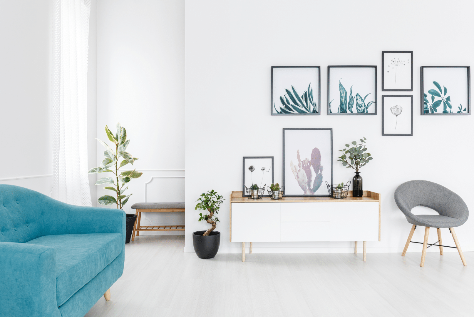
- 60” is a measurement to remember. Although different homes can require different placements, 60” on center is a great starting point. This means to place the center of your art piece 60″ from the floor. Then step back and see how that looks and feels. When hanging two art pieces, treat them as one and still hang them 60 inches from the floor to the center of the grouping. This rule also applies to groups of three and four. Make sure they are spaced only a few inches apart, so they look together and not disconnected.
- Eyes on center is another consideration. What will you most likely be doing in the room – sitting or standing? If in a hallway where everyone is standing, you’ll want to hang art higher (but not a foot from the ceiling!) than if you’re in a room where you’re sitting most of the time. Place the art so your eyes rest on the center as appropriate in the room. Consider where your eyes rest when you walk into the rooms you use the most, including the foyer, living room, and primary bedroom. Common sense must prevail here, however. If you are 4’10” or 6’10” eyes on center may not be the best placement methodology for you.
- Let your furniture guide placement. For a sofa or a headboard, start with 4″ to 8″ between the top of the furniture and the bottom of the art. This method will depend on how big the art piece is, and how much space exists between the furniture piece and your ceiling. Start here then step back to see if it looks right. NOTE: If the art is going above a sofa or console, the piece or group of pieces, should be approximately 2/3 width of the furniture.
- The buddy system is also a useful method. Ask someone you trust to hold a piece of art up against a wall while you instruct them to move it up and down an inch or so at a time until it looks right. Then change places to see if you agree.
Mistake #2: Not Realizing Size DOES Matter
A tiny piece of art on a small wall will look and feel just as awkward as a huge piece in a small space. Why? The wrong size art makes the entire room – and its furnishings – seem out of scale and out of balance.
If you’ve fallen hard for a piece that’s too small, consider creating a collage wall. Two ways to achieve a successful collage wall are:
- Use prints and photos with a similar theme and consistent frames. They could be black and white photos, botanicals, sketches, vacation pics, etc. Mixtiles is a great, inexpensive way to have fun with same size and shape photos. An added advantage is that they stick to the wall, so no nails needed, and the photos can be moved around easily.
- Go with completely different pieces in mixed frames for an eclectic look. Hang large and medium pieces 2-3 inches apart, and smaller pieces 1.5-2.5 inches apart.
Other options for your too small art piece are to reframe using a larger frame and mat to make the piece seem larger. Or, you can paint (or hang) a solid square or rectangle of color or a beautiful piece of wallpaper behind the piece to make it seem larger. But don’t worry about achieving perfect proportion when hanging art, just remember the “go big or go home” attitude: If you’re going to do something out of scale to the rest of the room, make it obviously out of scale with the room, either way too big or way too small, so it seems intentional.
If you find you’re staring at a long, cold expanse of barren drywall, that’s usually an ideal place to hang a favorite artwork. A short wall that is sometimes obscured by an open door may not need anything.
Mistake #3: Not Enough Variety
When I moved in with my fiancé, there were Thomas Kinkade prints in every room, in every size, all framed in heavy, ornate gold frames. Kinkade’s are not really my thing, but he had a sentimental connection to this collection. So we compromised by creating The Kinkade Room – a guest bedroom filled with the entire collection. While the Kinkade’s in every room were overwhelming, they look great in The Kinkade Room.
When you hang the exact same type of art on every wall in every room of your home it’s called the Art Gallery Effect. It’s also called as “boring.” Mix unframed canvases and framed art. Hang tapestries or quilts. Display a collection – farm tools, decorative plates, masks, old printing stamps – and group on the wall. Your wall can tell the story of who you are and what you love.
Mistake #4: Improper Hanging
I used to report to a fellow who, upon entering any room, went about straightening crooked artwork. His actions drive me nuts, so I quickly got in the habit of checking for crooked artwork every day. This has become a lifelong habit (just like making sure the seams on all lampshades are turned to face the wall). Crooked artwork lends an air of “no one cares” to the space and is easily avoided by:
- Using two nails spaced a couple of inches apart (depending on the size of the piece) instead of just one.
- Adding small rubber bumpers to the corners of the piece will prevent your art from moving about.
Mistake #5: Not Leaning
Like an attractive person leaning up against the bar, leaning artwork can lend visual interest to a room. Consider leaning a tall mirror against the wall in a bedroom or hallway, or leaning a piece of art placed on top of your sofa, dresser, desk, or TV stand. Not only does this trick add visual interest, it also adds textural interest to your place.
Well there you have it. You’ve decided where to hang all the beautiful things in your home. Next step? The actual hanging. Tune in next week for tips on the handyperson part of the process – The Art of the Hang.